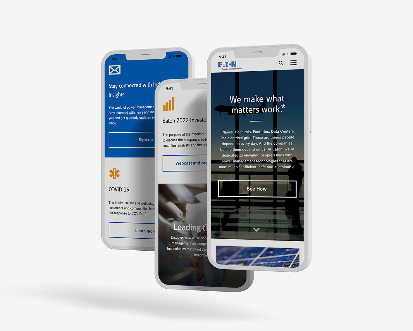
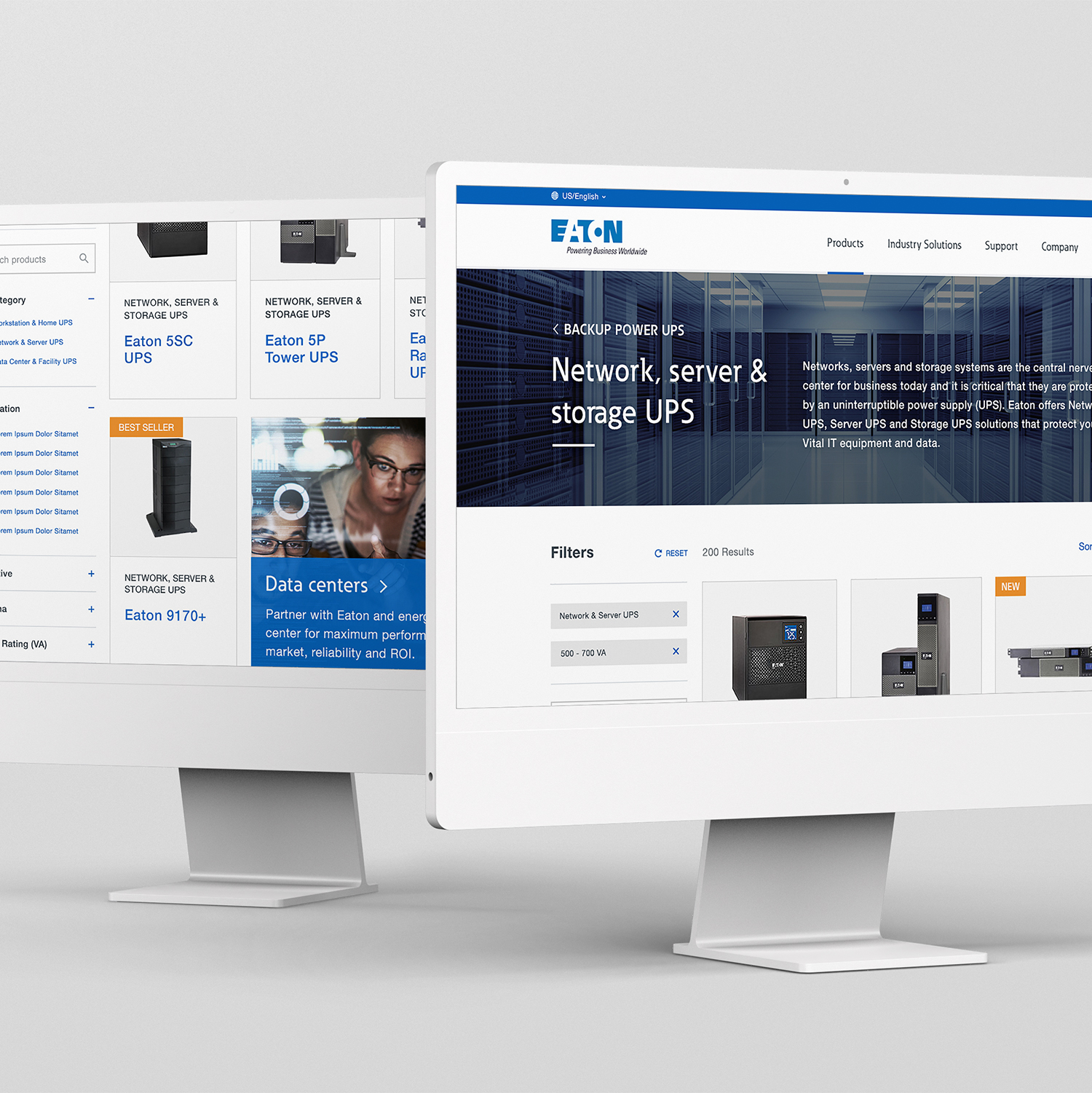
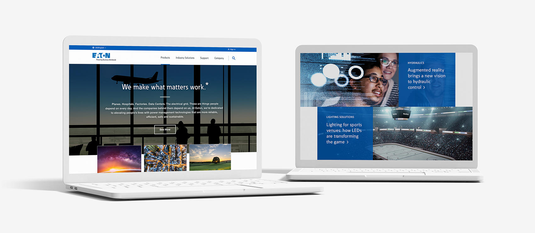
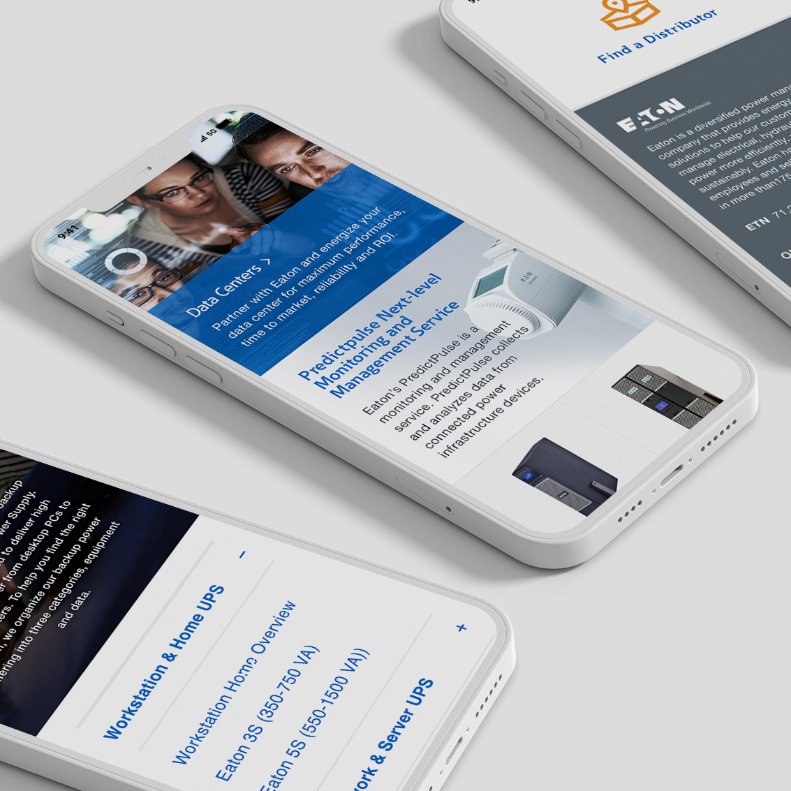
While working at Razorfish, I had the opportunity to be involved in being a part of a team that was tasked to build a new CMS Website for Eaton Electric. The objective of the project was to take an already existing system, and transform the experience and digitize it so that they would be able to update it more frequently with company news, so that it was on consistent and concise experience for both the end user and the admin user.

Thinking mobile first with transitions in mind.
When creating the application we went through a ton of different types of thinking for the UX and UI parts of the build. In order to solve for the problem efficiently we wire framed out multiple interaction types to make some choices on how we wanted it to feel over all. We went with a clean and modern approach to the design and felt like the transition should feel the same as to compliment the visual design.
Menu details and UX exploration
When designing this application and its menus, the client wanted a more fresh and modern approach, as to appeal to a younger market and user base. After some exploration we went with a centered circle menu approach, as to give the user access to the menu at all times in a easy to understand and use position in the app. Phones are getting pretty big these days, so keep the menu low a near the home button helps facilitate ease of use.


The feed, and native integration
We wanted to build something that felt new and fresh but still familiar to the user. We did this by establishing certain type of mobile expectancies through out the app experience. One of those items, was “The Feed” on the home page. The application focused around a timeline of events, and we wanted the user to be presented the items happening now and in chronological order, much like they would receive updates on all their favorite apps.

